Dimensions: percentage
Relative to some other
dimensions
div {
  width: 300px;
  height: 100px;
}

div p {
  width: 50%;
}<p>: 50% width of the parent div
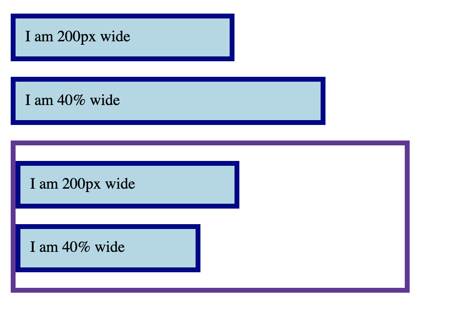
Dimensions: percentage
.box {
  background-color: lightblue;
  border: 5px solid darkblue;
  margin: 1em 0;
}
.wrapper {
  width: 400px;
  border: 5px solid;
}
.px {
  width: 200px;
}
.percent {
  width: 40%;
}
<div class="box px">
  I am 200px wide
</div>
<div class="box percent">
  I am 40% wide
</div>
<div class="wrapper">
  <div class="box px">
    I am 200px wide
  </div>
  <div class="box percent">
    I am 40% wide
  </div>
</div>
Percentage width
is calculated from the parent
Today
Box model
Layout flow
Float
Positioning
Flexbox
Everything displayed in
CSS is a box !
The Box Model
Each element has a rectangular box
text
elements that looks circular
Inspect -> Layout (Firefox)
Inspect -> Computed (Chrome)
How does the box model work?
It is all box stacking
Block boxes<h1>, <p>, …
The box will break into a new line
If width is not specified
will use up available space within parent
Inline boxes<span>, <a>,
…
The box will not break into a new line
width and height can’t be setIf there is no space, then the overflow will continue to a new
line
Inline Block
boxes
The box will not break into a new line
But, you can set width and height
You can change box display
types
Set the display
property
.inline {
  display: inline;
}

.block {
  display: block;
}
<p class="inline">First inline para.</p>
<p class="inline">Second inline para.</p>
<p>Another <span class="block">para with span.<p>
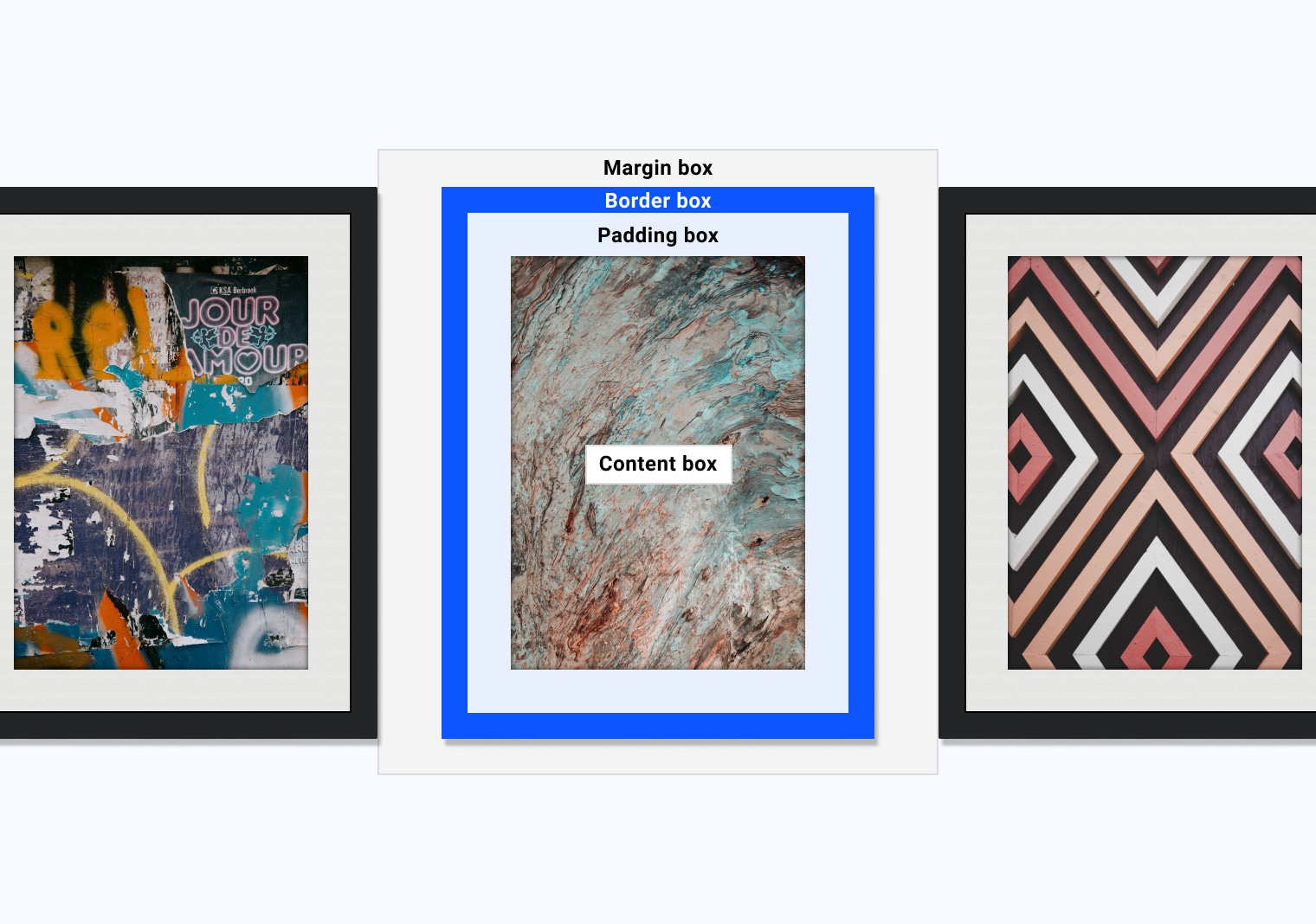
Box model areas
Box model areas
Similar to picture frames
Box model areas
Content
Padding
Border
Margin
Controlling the box areas
height and width
padding and border
adds to content box sizes
margin does not count to box size
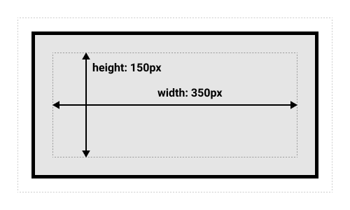
What’s the total height
and width here?
.box {
  width: 350px;
  height: 150px;
  margin: 10px;
  padding: 25px;
  border: 5px solid black;
}
What’s the total height
and width here?
.box {
  width: 350px;
  height: 150px;
  margin: 10px;
  padding: 25px;
  border: 5px solid black;
}
Width: 410px
Height: 210px
This default rule is 👎🏾
Inconvenient
to add padding and border to get actual box size
Alternative box model
box-sizing: border-box;
Height and width applies to the box
Border and padding get pushed in
content = box - (border + height)
More predictable
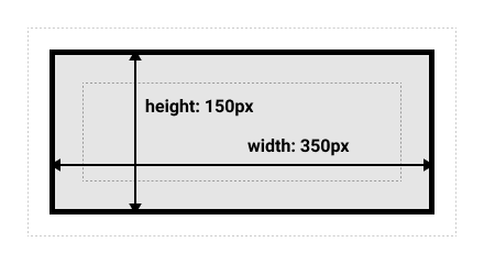
What’s the total height
and width here?
.box {
  box-sizing: border-box;
  width: 350px;
  height: 150px;
  margin: 10px;
  padding: 25px;
  border: 5px solid black;
}
What’s the total height
and width here?
.box {
  box-sizing: border-box;
  width: 350px;
  height: 150px;
  margin: 10px;
  padding: 25px;
  border: 5px solid black;
}
Width = 350px
Height = 150px
Box models
Default
Alternative
This default rule is 👎🏾
Inconvenient
to add padding and border to get actual box size
Todo
Go to the activity from our
last class
Make the inner box width same as the wrapper
Todo
Now use the alternative box model:
html {
  box-sizing: border-box;
}

*,
*::before,
*::after {
  box-sizing: inherit;
}
More predictable height and width
Alternative box model is
more common
html {
  box-sizing: border-box;
}

*,
*::before,
*::after {
  box-sizing: inherit;
}
Today
Box model
Layout flow
Float Positioning
Flexbox
Float
Takes an element out of the normal box stacking flow
Places it left or right side of the parent
Other inline elements will “float” (“wrap”) around it
Mostly for image and text
Float
.box {
  float: left;
}
<div class="box">Float</div>
<p>
Lorem ipsum dolor sit amet
</p>Example
Can you float it to right?
Today
Box model
Layout flow
Float
Positioning Flexbox
Positioning
Mostly for elements out of the normal flow. E.g.,
Adding a caption on top of an image
Fixed tab header
Image that overlays over other elements
Options
static (default), absolute, fixed, sticky
Relative
Position
Element placed following the normal flow
You can move the final position
top, bottom, left,
right values
Check it out !
Absolute
Position
Element moves out of the normal flow
Sits on a separate flow
great for isolated UI features
top, bottom, left,
right values
placement within the container element
Absolute
PositionWhat’s the container element
Any ancestor element with their position explicitly defined
Default is the <html> element
Todo
Open Activity
03
In .absolute class:
Change top property
To place the element before “Overview”
Todo
Now in index.html, set:
Where does the <p> move?
Absolute
PositionWhat’s the container element
Any ancestor element with their position explicitly defined
Default is the <html> element
Fixed
PositionFixed in relation to the
viewport
Persistent element always visible
See the example
Today
Box model
Layout flow
Float
Positioning
Flexbox
Flexible Box Layout model
Modern approach to layout
section {
  display: flex;
}
Flexbox
Single dimension layout
Arrange items in rows or columns
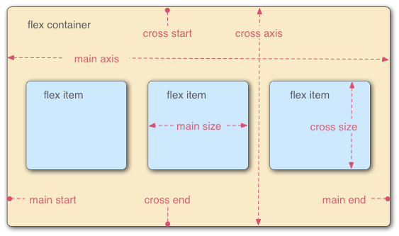
Flex model
Main axis
Direction of how items are laid out
row or column
Cross axis
Parent element
Main axis direction
Default is row
/* Set main axis to column */
flex-direction: column;
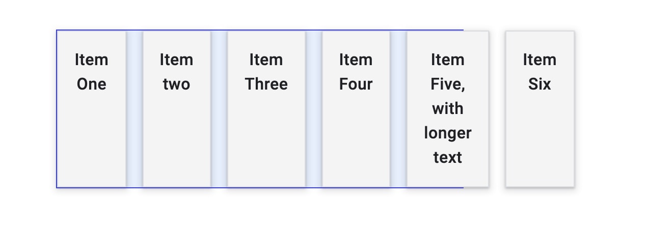
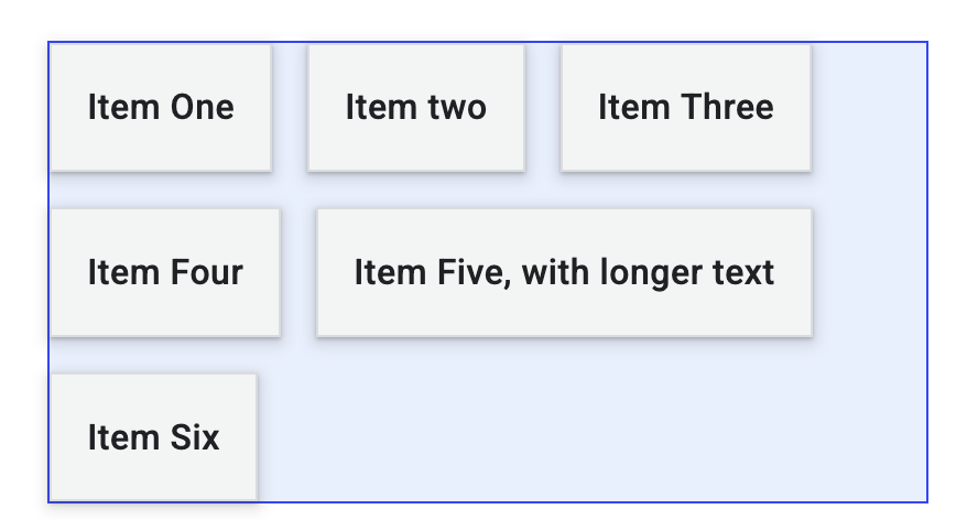
Wrapping
Items overflow by default
Not good for most cases
Wrapping to next line
flex-wrap: wrap;
Default
flex-wrap: wrap;
flex-flow shorthand
flex-direction: row;
flex-wrap: wrap;
=
Todo
Open Activity
04 in Firefox/Chrome
Go to Dev Tools –> Layout
Firefox: “Flex Container”
Chrome: “Flexbox”
Set flex direction to be column
Todo
Change Browser width
Check the page in “iPhone”
What happens?
Flexible sizing of items
A key advantage!
Flexible sizing of items
flex: proportion
values
How much available space an item will take
compared to other flex itemsalong the main axis
What’s the size of each item?
3 items — each with flex: 2;
What’s the size of each
item?
3 items
/* first item */
flex: 1;


/* second item */
flex: 1;


/* third item */
flex: 2;
Item 3 twice the size of Item 1 and 2
Flexible sizing of items
Allows setting minimum sizes
/* at least 100 px */
flex: 1 100px;
flex: auto
Absorbs available space
Shrinks to minimum size when necessary
Todo
Open Activity-04 again
Make Penn
Each item should be at least 150px wide
Today
Box model
Layout flow
Float
Positioning
Flexbox