HCDD 340 — Assignment 02
Description
For this assignment, you will create a Penn State profile card. A key
goal here is to make sure that the profile works for different screen
widths. Please use the starter file in Canvas (Files → Assignments → Assignment-02).
You will only update the CSS rules for the assignment
(i.e., no need to change index.html)
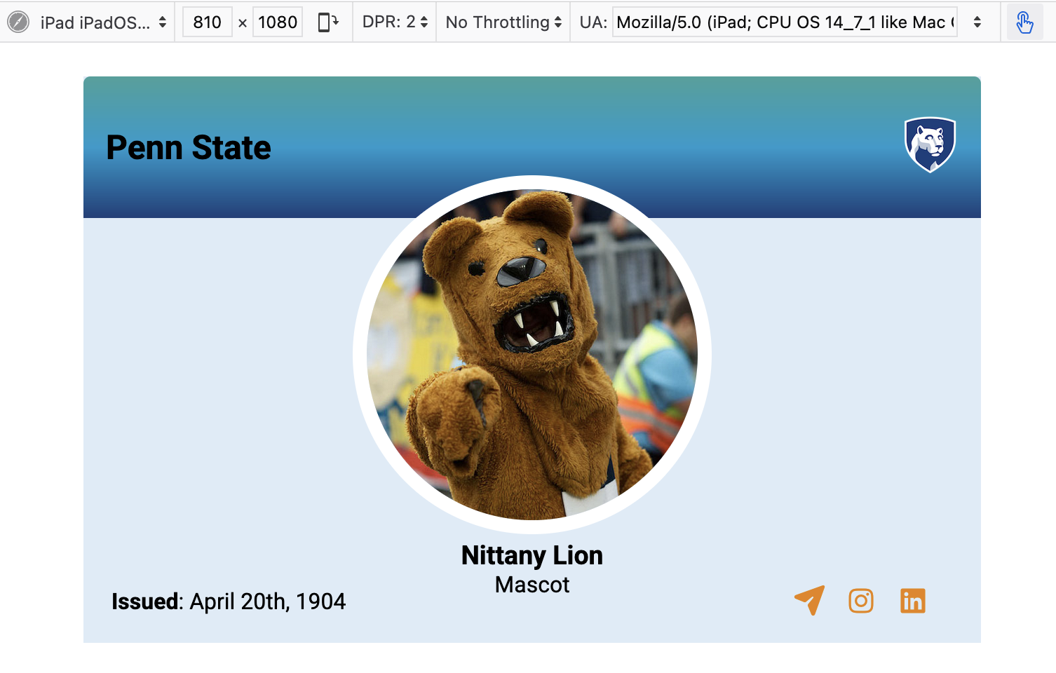
The completed assignments should look something similar to:
Deliverables
Please upload the following files (as a zip file):
- Two screenshots of the profile on:
- Your code folder. For grading, we will open the
index.htmlin a browser. The uploaded folder must be self-contained — please make sure that there is no error when loadingindex.htmlin a browser
Requirements & Rubrics
The profile looks consistent in both mobile and non-mobile devices (3 pts)
The header and the footer each occupy approximately 25% of the profile. (2 pts)
In the header, the title “Penn State” and the logo are aligned to the left and the right ends, respectively. (2 pts)
The profile image is horizontally centered. (2 pts)
The profile name and description (“Nittany Lion”, “Mascot”) are horizontally centered. (2 pts)
The profile image overlaps with the header (say, around 12%). (2 pts)
The text (issued) and icons are aligned to the left and the right ends. (2 pts)
Implementation suggestions
Layout
Please use Grid and Flexbox for the
assignment. Note that you can have another Grid or
Flexbox within a Grid cell or
Flexbox item. Before starting to code, it will be important
for you to identify different components in the layout. What are the
parent containers? What are the alignments of different elements within
the parent containers? The index.html file provides some
hints about potential components.
For example, the profile has three major components — header, content, and footer. Within the header, there are two sub-components — title and logo. And so on. Start with the major components and then work your way in. You can create a one-column grid with three rows for header, content, and footer (note: you can also use Flexbox). Then, you can create a grid with 2 columns for the header components as shown below (again, you can choose to use Flexbox here too):
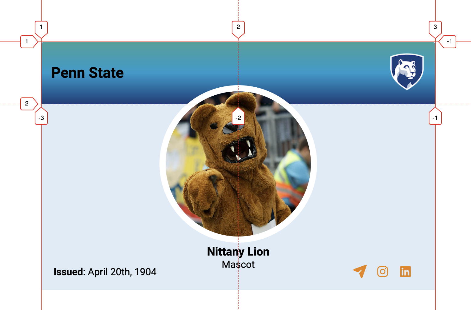
Profile image overlapping with the header
The profile image is within the content component. But, it overlaps with the header section. Note that you can use relative positioning to move elements.
DevTools
DevTools can help you to identify potential layout issues as you work on the assignment. Furthermore, you can use DevTools to quickly explore different alignments for Flexbox and Grid. Please consider using these tools as necessary: